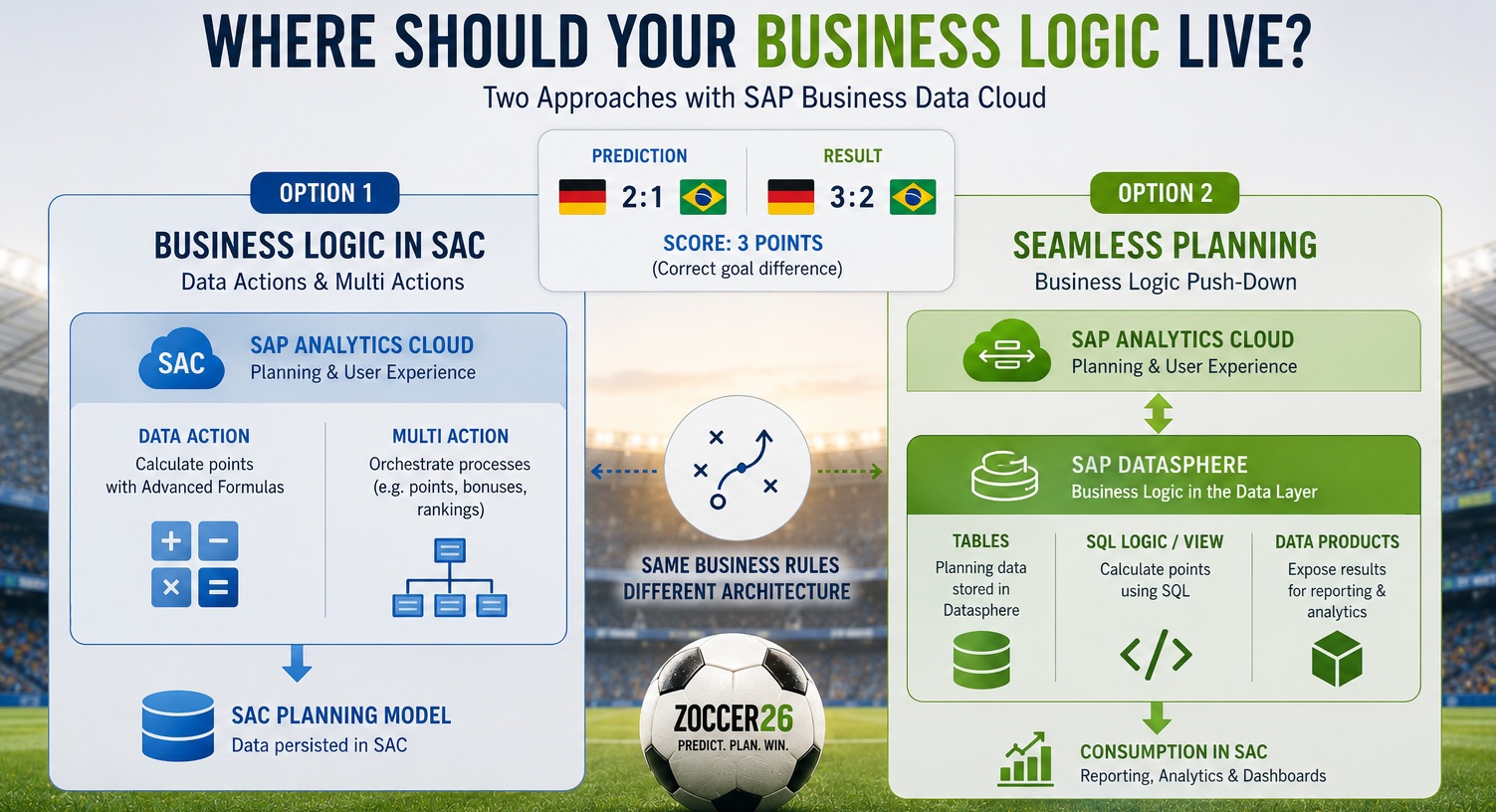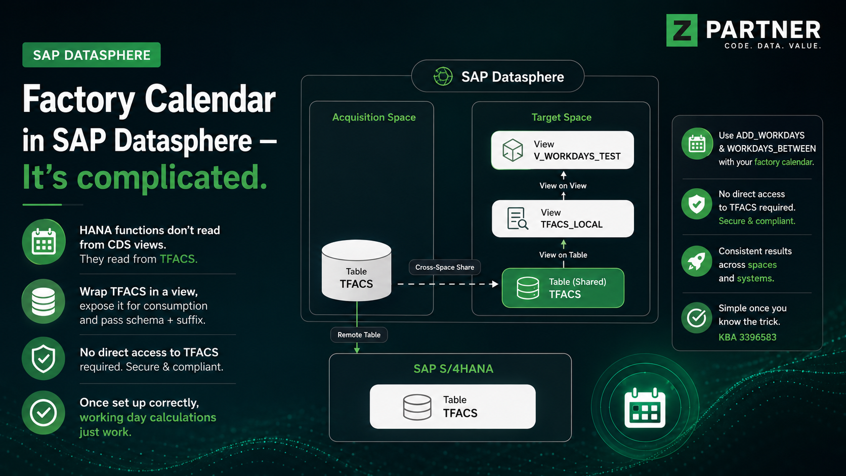
Introduction
This How-to Paper provides guidance on how to display a deviation in a table in the SAP Analytics Cloud in conformity with the International Business Communication Standards. This type of visualization is very useful because you can visualize a table together with a bar/column chart. The possibility of combining two different forms of data analysis/visualization in a table shows an enormous efficiency increase and simplification of the reporting itself.
Walk through
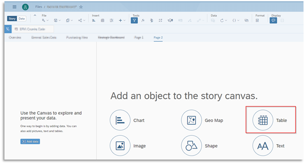
1.Create a Table with at least one measure
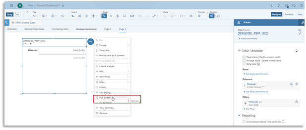
2. Switch to full screen mode for a better overview of the table
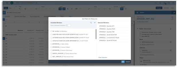
3. Select all Measures and Dimensions you want to visualize in the Table
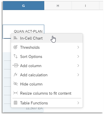
4. Select a Measure you want to visualize as an In-Cell chart in the table
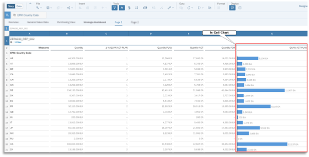
Right-click on the measure column or row header in the Table and Select the In-Cell chart option. Each cell in the table of the selected measure displays a bar and a value.
5. Result
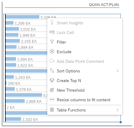
Now as you can see the measure is converted into Chart inside the Table.

If you want to hide the bar chart just repeat the 4th step à right-click the measure header again and click on In-Cell chart.
6. Additional Formatting
Right-click on the In-Cell chart to access the context menu where you can do some more adjustments like inserting a filter, setting new thresholds, or sorting the chart.
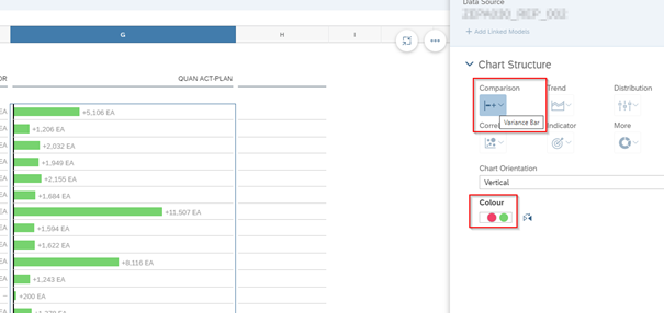
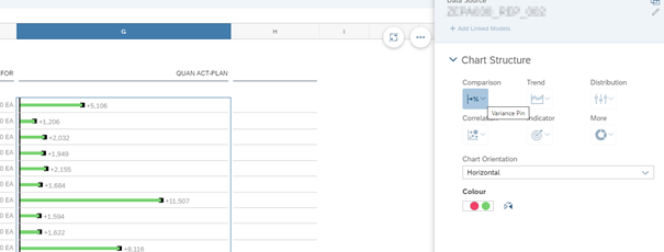
7. Changing bar chart to a variance chart
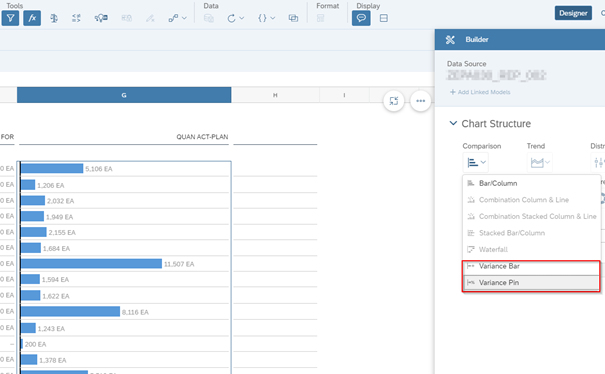
Click on the column which includes the bar chart and open the builder. Select “Comparison” under the “Chart Structure”-Menu and select “Variance Bar” or “Variance Pin”.
Conclusion
All in all, the possibility to visualize deviations within a table is a very useful tool which can also be implemented very easily and quickly. The biggest advantage is that the conventional view of a table can be upgraded by a graphical representation and thereby the data evaluation can be displayed more efficiently.